Screen design is for sharing the structure and flow of screens with clients, partner teams and your AI. Elements are drawn in gray lines and fills, and you can’t pick colors or fonts, so nobody mistakes a wireframe for the finished design. Color only appears where it carries meaning, such as “Primary” or “Invalid”.
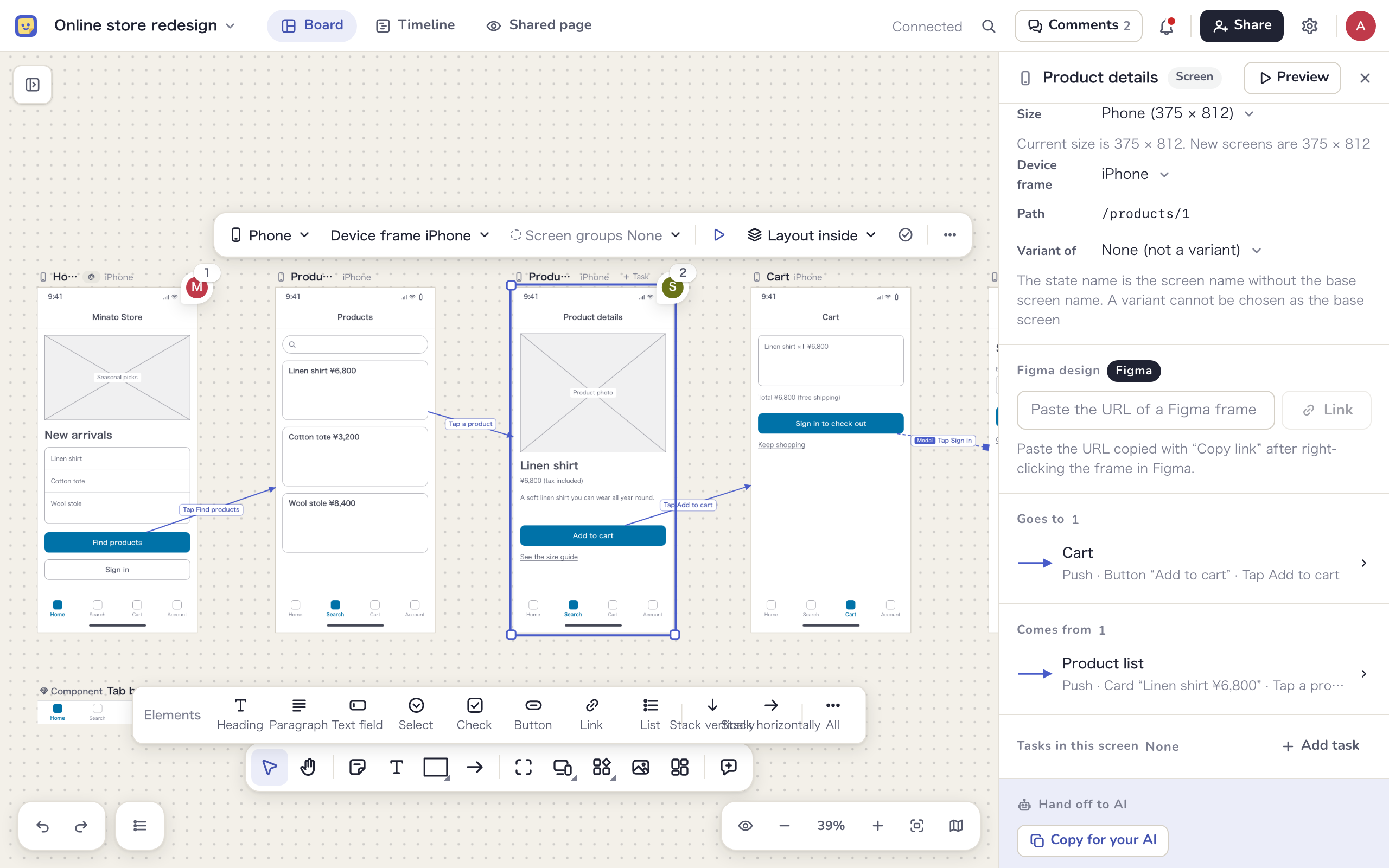
Place a screen
- Click “Screen” in the toolbar. A list opens
- Choose a “Size” and a “Device frame”
- Click the canvas. The screen is placed with its top left corner where you clicked, and named “Screen” with a number
| Size | Placed at | Device frames |
|---|---|---|
| Desktop | 1440 × 900 | Browser (default), App window, None |
| Tablet | 768 × 1024 | iPad (default), Browser, Android, None |
| Phone | 375 × 812 | iPhone (default), Android, None |
- For a taller screen, drag the bottom edge after placing it
- You can change the size and device frame later in the small toolbar or under “Screen settings” in the side panel
- Use “Path” for the screen’s URL, such as /login. It appears in the address bar of the browser frame and goes into the design brief for your AI
- Double-click the heading to rename the screen in place
- Press S to skip the list and place a screen with the size and device frame you used last
A locked screen can’t be resized. Click “Unlock” first.
The screen heading
Each screen has a heading with its name, an icon for the size, the device frame and the progress of tasks inside it (such as “1/3 done”). Select the screen or hover over the heading to show “+ Task” and “…”. The “…” menu has “Add a task”, “Make this screen a task”, “Write a note”, “Duplicate” and “Delete”.
Variants
To draw an error or loading state of a screen such as “Sign in”, make a variant.
- Duplicate the original screen and give it a name that starts with the original’s name, such as “Sign in (error)”
- Select the copy and choose “Sign in” under “Variant of” in the side panel
The heading then shows the original’s name, as in “Sign in › error”, and the original screen lists its “Variants” in the side panel. In the design brief, variants come right after their original.
Place elements
While a screen or something in it is selected, element buttons appear above the toolbar. Click “Heading”, “Paragraph”, “Text field”, “Select”, “Check”, “Button”, “Link” or “List” to stack that element below the lowest one in the screen, at the full width of the screen. The new element is selected, so you can keep clicking to stack more.
Other elements are under “All”. You can also pick a type with “Element” in the toolbar (W) and click anywhere to place it, including outside a screen.
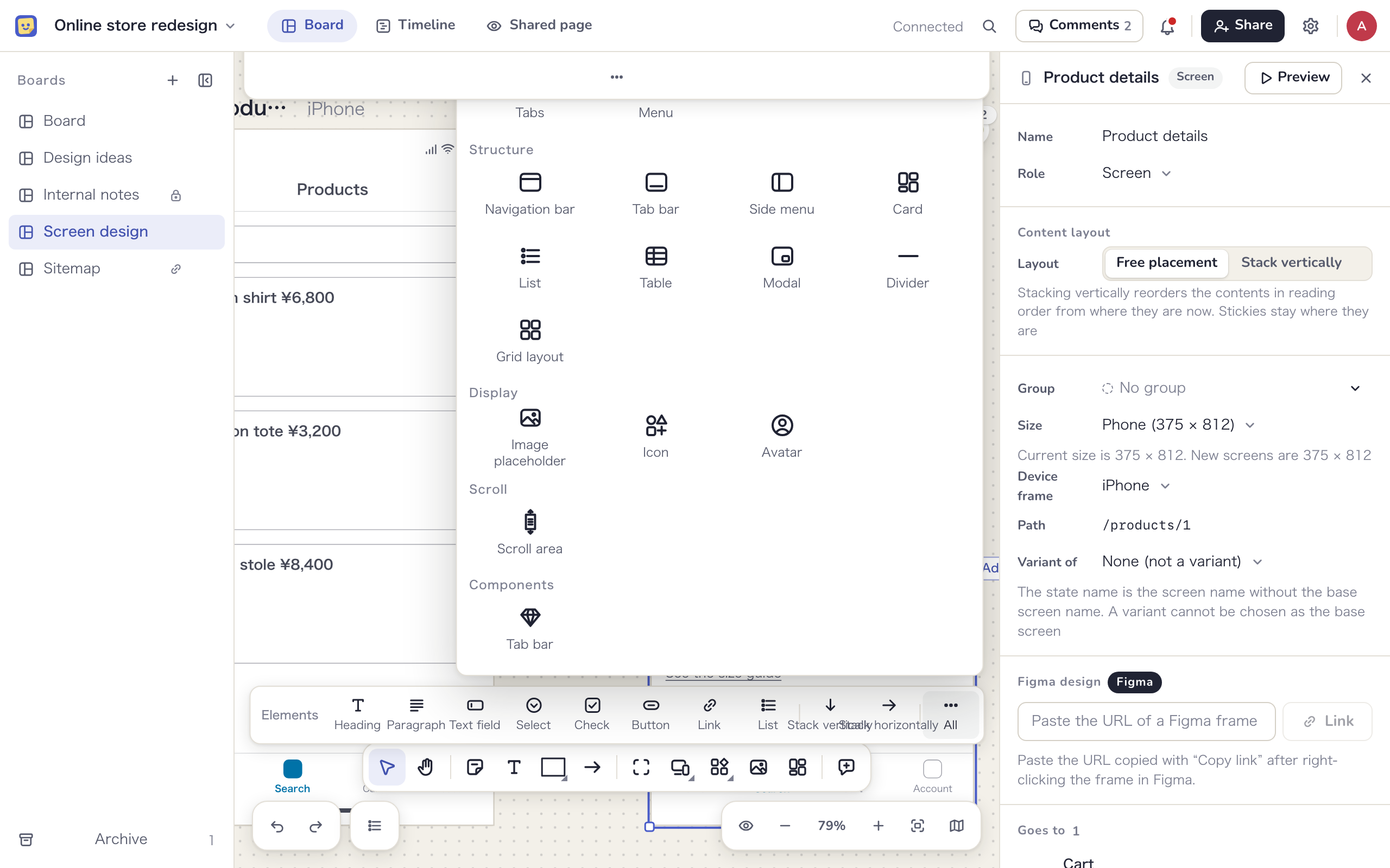
| Group | Elements |
|---|---|
| Text | Heading, Paragraph, Label |
| Input | Text field, Text area, Select, Checkbox, Radio buttons, Toggle, Slider, Date field, Search field |
| Actions | Button, Link, Icon button, Hotspot, Tabs, Menu |
| Structure | Navigation bar, Tab bar, Side menu, Card, List, Table, Modal, Divider, Grid layout |
| Display | Image placeholder, Icon, Avatar |
| Scroll | Scroll area |
Besides elements, you can put sticky notes, text, shapes and images in a screen. Sticky notes work well as memos on a screen.
Element text and state
Double-click an element to edit its text. Select an element to edit these fields under “Element text and name” in the side panel. Fields the element doesn’t use are hidden.
- Text, placeholder and items (one per line). For a table, each line is a row and columns are separated with “|”
- “Selected item” and icon
- “Name”, passed to your AI as the name of a variable or form field. Letters, digits, “_” and “-”, up to 64 characters
- “Element state”: “Emphasis” (Normal, Primary or Danger), “Checked”, “Invalid” and “Disabled”
You can also change the state with “State” in the small toolbar. The kind of an element can’t be changed after placing it, so delete it and place a new one instead.
Scroll areas
To show a part of a screen that scrolls, use “Scroll area” under “All”. When you place it in a screen, a content frame named “Screen name › Scroll” appears to the right of the screen, linked to the area.
- Put elements in the content frame. The scroll area shows the part of it that is visible
- Drag the handle of a selected scroll area to change what it shows. The small toolbar switches the direction between vertical and horizontal
- “Show whole” opens the whole content frame in a small window. Double-click the scroll area to jump to the content frame
- Scroll areas can only go inside a screen. Deleting one deletes its content frame too
Lay out elements
A layout arranges elements vertically, horizontally or in a grid automatically. You spend less time lining things up, and your AI receives the structure with its nesting intact.
- “Stack vertically” and “Stack horizontally” in the element buttons add an empty laid-out frame. Keep it selected and click element buttons to add elements inside. For a grid, use “Grid layout” under “All”
- Select several elements in a screen and click “Lay out” in the small toolbar (⇧+A) to wrap them in a laid-out frame based on where they are now. It isn’t available when the selection includes overlapping or locked elements, and the button tells you why
- Drag an item inside to see an insertion line and drop it to reorder. Drag it outside to take it out of the layout
- Select an item inside and press the arrow keys to move it one step in the order. ⇧+Enter selects the parent and Enter selects the first item inside
Select a laid-out frame to change these values under “Layout” in the side panel.
| Field | Options |
|---|---|
| Direction | Free, Vertical, Horizontal, Grid |
| Gap and padding | Pick from preset values. Numbers can’t be typed |
| Columns | For grids |
| Alignment and distribution | Where items sit and how they spread along the direction (such as spaced to both ends). “Stretch” sets every item inside to “Fill” |
| Wrap items that do not fit onto the next line | For horizontal layouts |
| Appearance | “Outline” draws a gray outline with rounded corners |
| Size | Width and height can be “Fixed”, “Fill” or “Hug contents” |
| Order | Drag rows, or press ⌥ with the up and down arrows, to reorder |
A screen itself can use “Free placement” or “Stack vertically” for its content layout. Stacking vertically reorders the elements in reading order from where they are now. Screens your AI creates through MCP start out stacked vertically. To remove a laid-out frame and keep what is inside, click “Remove frame, keep contents” in the side panel.
Draw the screen flow
- Click “Arrow” in the toolbar (A)
- Start dragging from a screen, or from a button or other item in it, and release on the destination screen. Even if you release on an element, the destination is the screen
- Double-click the arrow and write the trigger, such as “Tap Sign in”
Select a transition arrow to choose its type with “Transition type” in the small toolbar or under “Screen flow” in the side panel. The side panel lists “Trigger”, “Type”, “From” and “To”; click From or To to jump there on the board.
| Type | In the preview | Line |
|---|---|---|
| Push | Replaces the screen. Back returns to the previous one | Solid |
| Replace | Replaces the screen and drops the way back, as with the home screen after signing in | Solid |
| Modal | Dims the screen and overlays in the center | Dashed |
| Sheet | Dims the screen and slides up from the bottom | Dashed |
| Popover | Overlays a small panel near what was pressed | Dashed |
| Back | Returns to the previous screen, or closes an overlay | Dotted |
An arrow drawn from the screen itself stands for a transition that doesn’t depend on pressing anything, such as moving on after loading or after a delay. Select a screen and the side panel lists where it “Goes to” and where it “Comes from”; click a row to jump to that screen.
Showing transition arrows
When many screens make the arrows hard to read, use “Transition arrows” at the bottom right to switch between “Show all”, “Selected screens only” and “Hide”. “Selected screens only” shows just the arrows going out of and into the selected screen and the screen under the cursor. This only changes what you see on your device, not what others see.
Follow the flow in the preview
Select a screen and click “Preview” in the small toolbar or the side panel to show it large, inside its device frame. It is meant for clients to click through the flow themselves, and anyone who can see the board can use it.
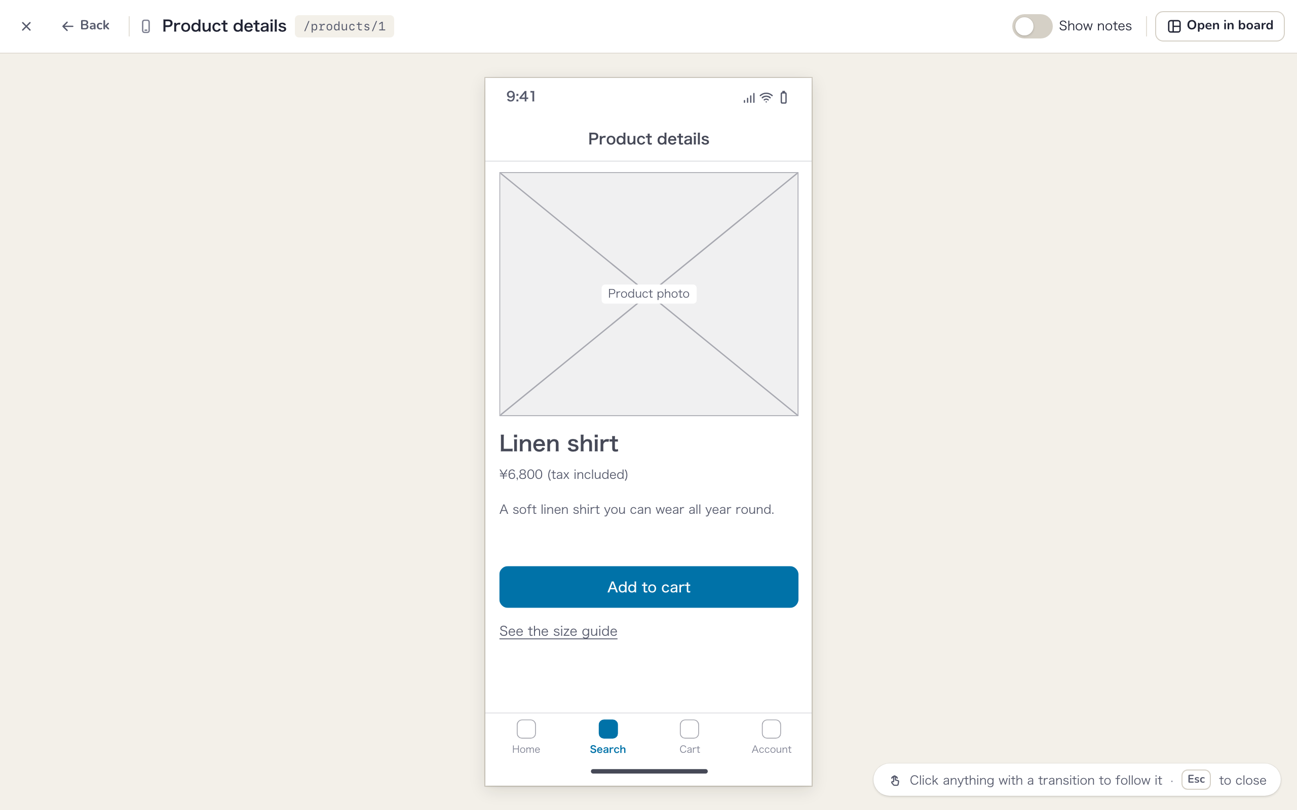
- Click an element that starts a transition and the preview plays that transition. Clicking somewhere with no transition briefly highlights what you can click
- When one element has two or more transitions, pick one from “Choose a transition”
- The header has “Back”, the screen name and path, buttons for transitions drawn from the screen itself (“From this screen:”), “Show notes” and “Open in board”. Press Esc to close
- Sticky notes in screens only appear when “Show notes” is on
- Scroll areas really scroll, so you can look through their contents
- Press Tab to step through the transition sources and Enter to follow one
Send the URL of an open preview and the other person starts from the same screen. Only people who can see the board can open it.
Make components
Parts that appear on many screens, such as a navigation bar or tab bar, can become a component. You draw it once and it shows on every screen, and a fix to the main component updates them all.
- Select several elements in a screen and click “Make a component” in the small toolbar
- Check the “Name” and “Pin when placed”, then click “Create”
- The main component is created to the right of the screen, and a placed component replaces the elements you selected
To use it on another screen, select that screen, open “All” in the element buttons and pick it from the “Components” group. Double-click a placed component, or click “Open the component”, to jump to the main component. The main component has a dashed outline and a heading marked with ◇ and “Component”.
If the selection includes tasks, locked items, sticky notes or similar, it can’t become a component and the button tells you why. Transitions drawn from elements inside the main component work on every screen it is placed on.
- “Detach from component” turns it back into plain elements on that screen only
- Deleting the main component turns every placed copy back into plain elements, and a notice says how many screens were changed. Click “Undo” in the notice to reverse it
Change it per screen
Select a placed component to see “Overrides on this screen” in the side panel. Only the “Selected item” and “Text” of elements in the main component can differ per screen, for example to select the current screen’s item in a tab bar or change the title in a navigation bar. Changed fields are marked “Overridden”, and “Revert to main component” undoes them. Edit the items themselves and emphasis in the main component.
Pin to the top or bottom
A placed component can be set to “Pin to top”, “Pin to bottom” or “Not pinned”. Pinned to the top, it sits just below the device frame’s top bar; pinned to the bottom, just above the bottom bar, and it follows when you make the screen taller. Each screen can have one component pinned to the top and one to the bottom.
Group screens
Group screens by feature, such as “Auth”, “Products” and “Checkout”, and tell them apart by color. On a board with many screens, you can see which feature lives where even when zoomed out.
- Select a screen and open the group field at the start of the small toolbar, or “Group” in the side panel. Select several screens to group them at once
- Pick a group from the list. To create one, type in “New screen group name” and press Enter. A color that isn’t in use yet is picked for it
- To change the name or color, click the pencil (“Edit the name and color”) on its row. “Delete this screen group” removes it, and its screens become “No group”
Grouped screens show a colored dot and the group name in their heading and a line in the group’s color along the top edge. Boards with groups have a “Groups” button at the bottom right. It lists how many screens each group has; click a group to highlight only its screens. This, too, only changes what you see on your device. A board can have up to 20 groups.
Write notes
Put the intent of the design in notes: how elements behave, input rules, where the data comes from, how errors are handled. Notes can go on anything, including screens, elements and sticky notes.
- Select an item and choose “Write a note” in the … menu. The “Note” section opens in the side panel
- Write in Markdown and click “Save”. Headings, bold and italic, lists, quotes, code, tables and links are supported
Items with a note show a mark at the top right; hover over it to read the beginning. Each note can be up to 10,000 characters.
Everyone who can see the board can read its notes, Clients included. Put anything that should stay internal in an internal-only comment (Comments and activity).
Notes written by external participants are labeled “Note written by an external participant”. Once an internal member has checked the content, clicking “Mark as reviewed” removes the label.
Hand a design brief to your AI or developers
You can copy what is on your screens as a Markdown design brief and hand it to your AI or to the people building it.
- Select a screen, or a frame task that contains screens
- Under “Hand off to AI” in the side panel, choose whether to “Include” the “Comments (the ones you can see)” and the “Position and size”
- Click “Copy for your AI”. The same item is in the … menu of the small toolbar
A notice with the character count appears, and “View” shows what was copied. The brief contains the screen name, path, size, device frame, group, variants and notes, the elements from top to bottom with their names, text and state, the transitions, and the sticky notes and tasks in the screen. Up to 20 screens fit in one brief; any more are listed by name only.
Copying from the side panel also works for External viewers and Clients. An AI connected via MCP can read the same brief directly (Works with your AI).
Export as PDF
Select a screen or a frame with screens and choose “Export as PDF” in the … menu to get a document with a cover, a list of screens and one page per screen. To export every screen on the board, right-click an empty spot and choose “Export screen design as PDF”. Only internal members can export PDFs. Paper options and other details are in Shared page and view links.
Link Figma designs
Select a screen, paste the URL of a Figma frame under “Figma design” in the side panel and click “Link” to attach the design to the screen. Linked screens show a “Design” mark in their heading, and the preview lets you switch between “Wireframe” and “Design” to compare them. For connecting your Figma account and loading thumbnails, see Integrations.
Screens and tasks
Use “Make this screen a task” in the side panel or the heading’s “…” menu to turn the screen itself into a task, so the work of making it can have an assignee and a due date. “Add a task” or “+ Task” in the heading adds a task sticky note inside the screen. The heading and side panel show how many of those tasks are done. See Tasks for how tasks work.